Introduction
Have you ever thought about what to do with that finished page-turner of a thriller you read last week, or the pair of extra chairs that are sitting in your living room but are meant for *sitting*, or that baby stroller you bought for your munchkin but he's all grown up now?
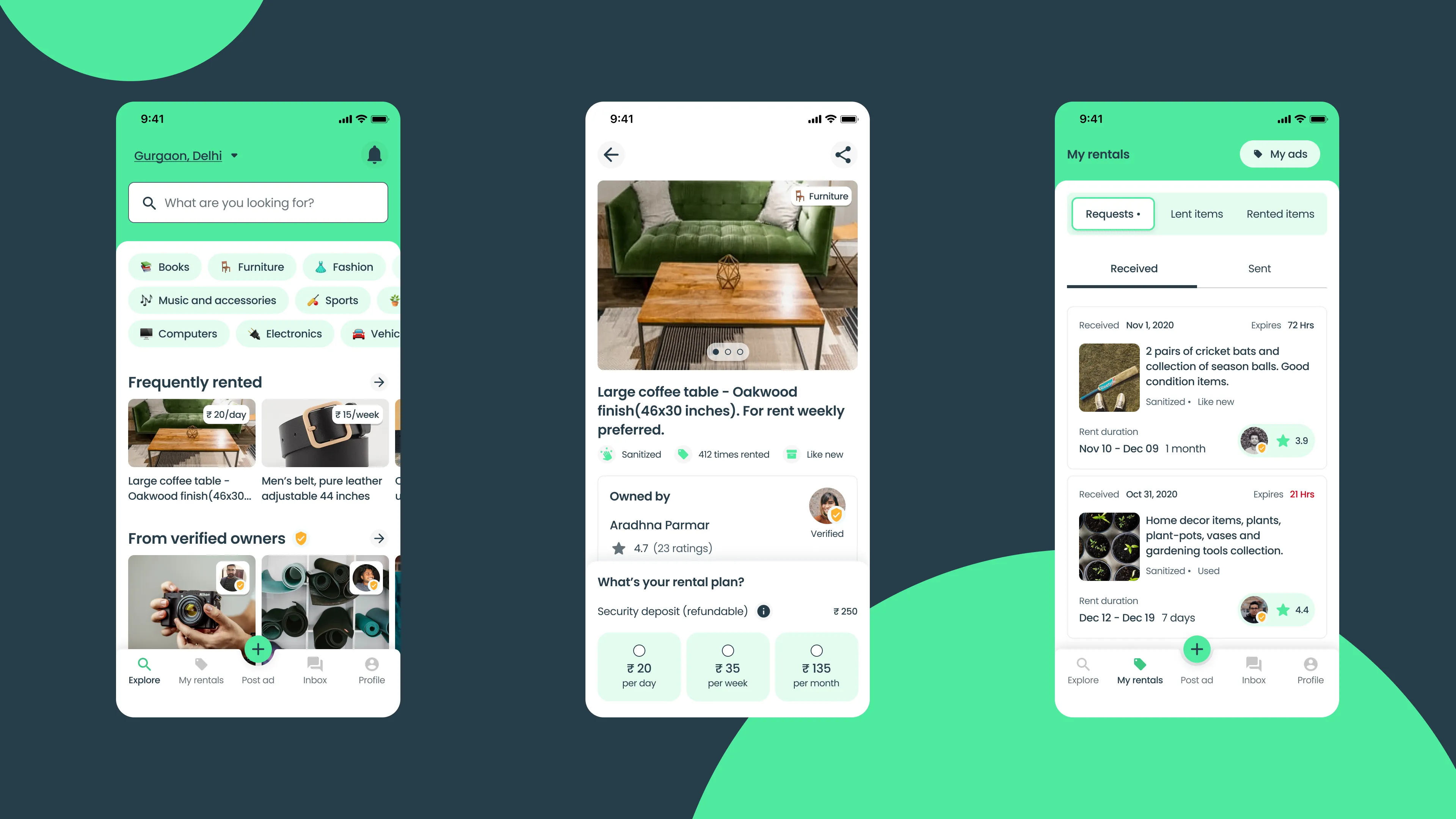
RentEarns app can help you with this. It lets you put up the less used items you own for rent. You can also look up items you might want to rent, for a month, week and even for a day, all within your neighbourhood.
A little backstory
RentEarns was my second attempt as a freelancer. My client was curious to see if there was a space to create a platform for short-term rentals of everyday items.
I was responsible for user research, branding, UI design and usability testing. Working on this project was challenging but equally exciting. Being the only designer, I had to coordinate with the team in India, gather research participants within the Indian demographic and create a brand idenitity for RentEarns.
The app is currently under development so look out for an App Store and Google Play store link soon 😉
1. Understanding need and competition
- Identifying our competition in the market
- Understanding people's need to put up something for rent through surveys
- About 24 users responded to 10 questions each
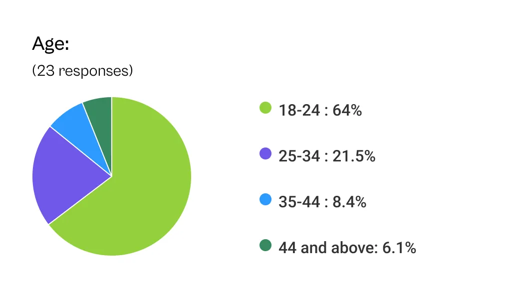
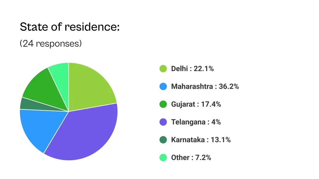
- Participant demographics ranged from 5 different states and 3 age groups
Who are we up against?
My client approached me with an idea to create an app for renting out everyday items. Our initial discussions included identifying competitive services, RentoMojo, Facebook marketplace, classifieds ad services like OLX India, and Quikr.
RentoMojo is the key competitor in the market and everybody has their rough edges;
- RentoMojo offers delivery and installation services but impose delivery charges on products
- Their business model is subscription based. This is more on the ecommerce side
- They maintain an inventory for rental products
- More importantly, users cannot create their own ad for renting out items
But we have a few tricks up our sleeves. We identified the following opportunities;
- An open platform for everyone to create and discover rentals
- Cutting out the middleman, or any man for that matter, we will offer direct communication between the renter and lender
- Initially, our revenue stream is through ads on the platform
- No middleman means no cost in maintaining and delivering of rental items
Do we really need a rental app?
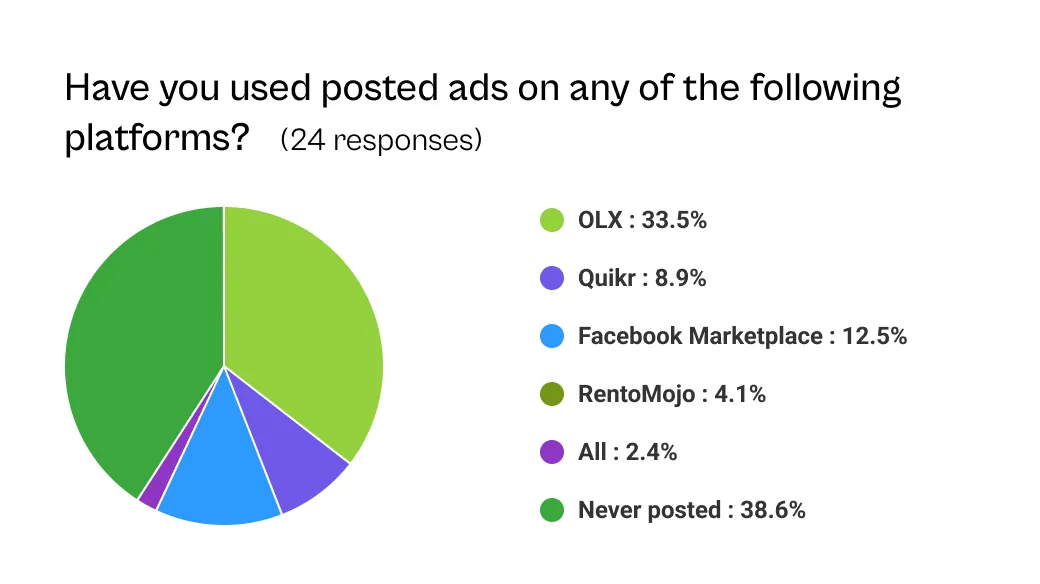
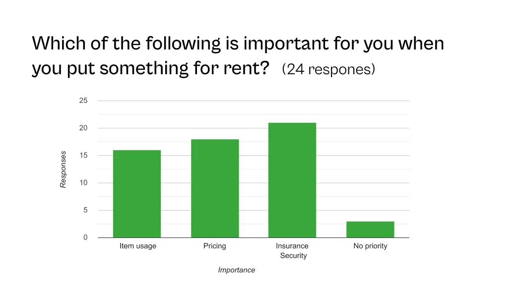
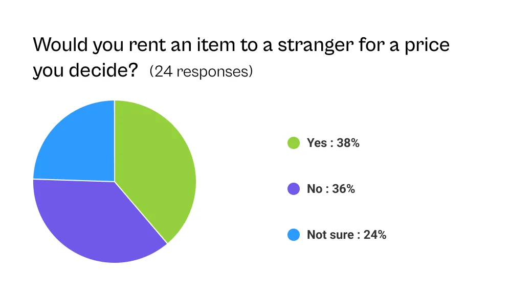
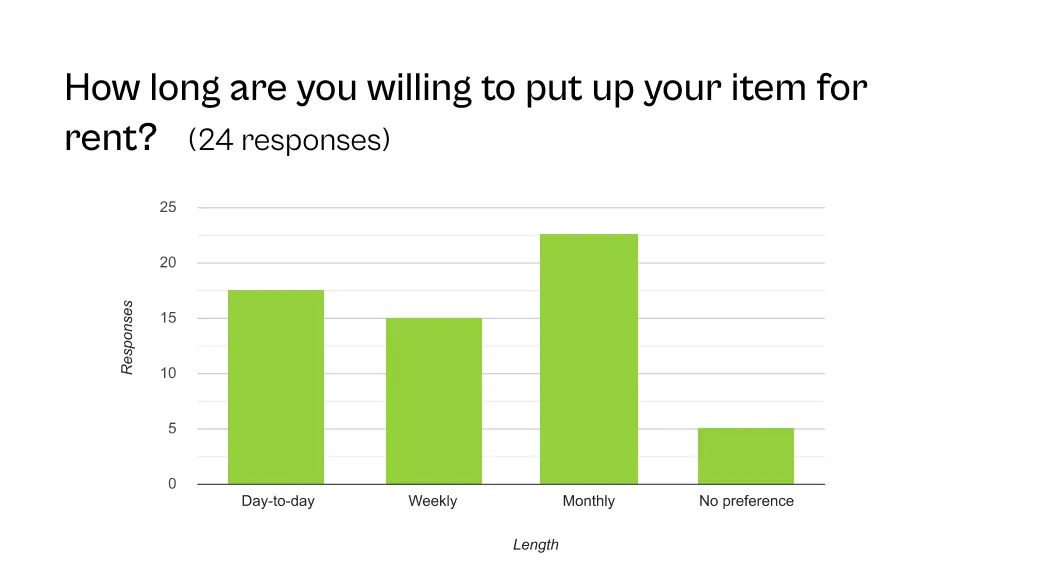
We asked around with a survey and some 24 curious souls responded to 10 questions each, providing with some interesting insights.
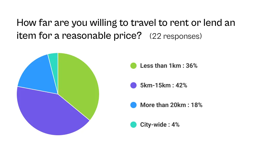
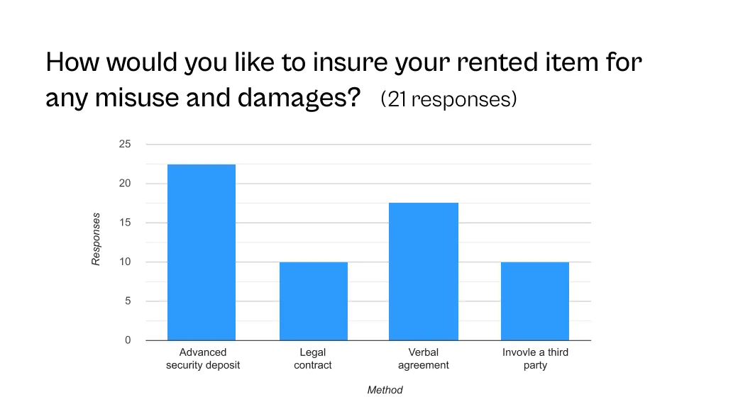
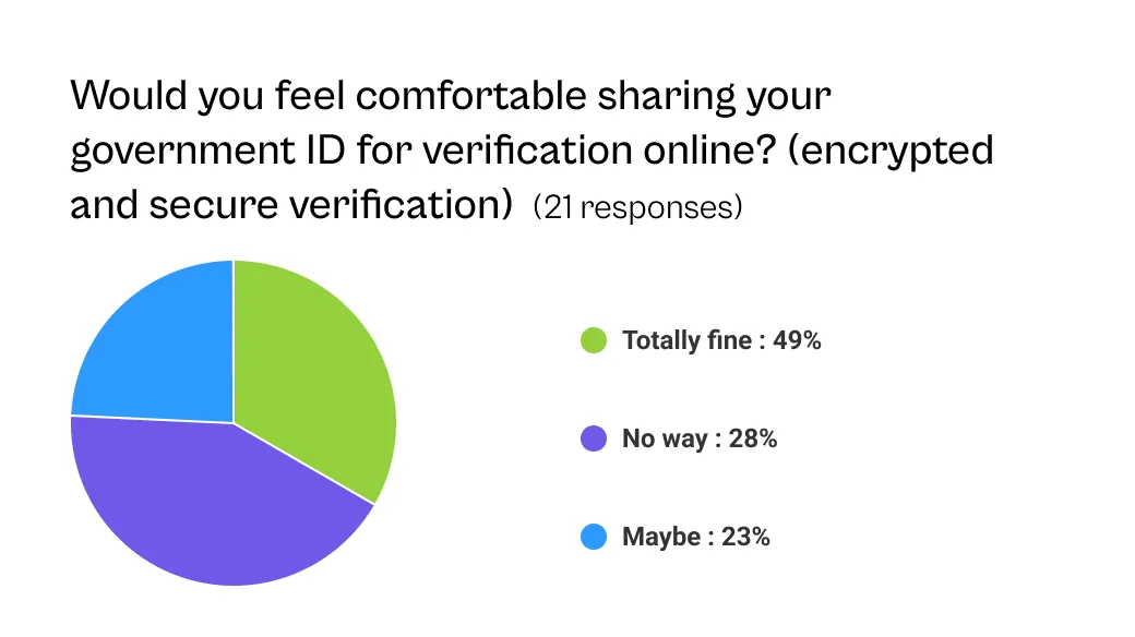
Survey Analysis
Based on the survey results, I took a note of the following metrics;
- The audience demographics are the highest in the young age-group and reside in some of the most developed states in India
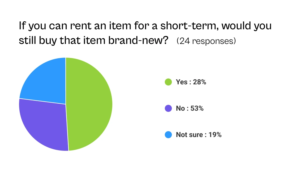
- More than 50% responded they would never buy a brand-new item if they can find the same thing for rent
- Insurance and pricing were some of the most important factors when people put up something for rent
- Some mixed feelings about renting out an item to a complete stranger
- About 40% of survey-takers said they are willing to travel within 15kms to rent/lend an item
- An advanced security deposit was the most preferred way to insure the rented product
2. Define
Create a trustworthy platform for discovery and renting everyday items on short-term basis.
- Personas
- How might we's
PERSONAS
I created 2 personas to reflect the pain points and goals;
Persona 1 / Renter

Anand Prakash Sharma
- Age
- 24
- Occupation
- Professional photographer
- Location
- Delhi, India
- Tech literacy
- Above average
- Personality traits
I am looking for equipment to rent for a day for my photo shoots in and around my locality because of my on-the-road schedule.
Pain points
- No options for renting items on short-term basis
- Has to carry shoot related items which can be bulky
- Has to pay monthly for rental equipments
Goals
- Seeking to get quality items from nearby location for easier returns
- Looking for day-to-day furniture rentals
- See relevant ads from genuine users
Persona 2 / Lender

Mridula Avasthi
- Age
- 28
- Occupation
- Meal-delivery business
- Location
- Mumbai, India
- Tech literacy
- Average
- Personality traits
I own multiple things that sit idly at my home. I could use some extra cash to invest in my business.
Pain points
- Unsure of lending items because of misuse or damage
- No way to know the reliability of the renting party
- Negotiating with people about pricing
Goals
- Not looking to travel far and wide
- Connecting with people through rentals as a network opportunity
HOW MIGHT WE (HMW)...
HMW
Make the product ad reliable and informative so that the end users know what they are dealing with
HMW
Create a straightforward process to list the rental ad
HMW
Maintain privacy for the end users in terms of contact and location details
HMW
Set rental availability, insurance and pricing for the owner's products
3. Ideate
This was the most exhilarating phase for me. Based on the personas and capitalizing on our competition's missed opportunities;
- We discussed some features that would be useful
- Putting a face to the RentEarns app
- Drafting a user flow
PRIORITIZING APP FEATURES
It took us 6 virtual meetings and 3 iterations over 30 hours of zoom calls.
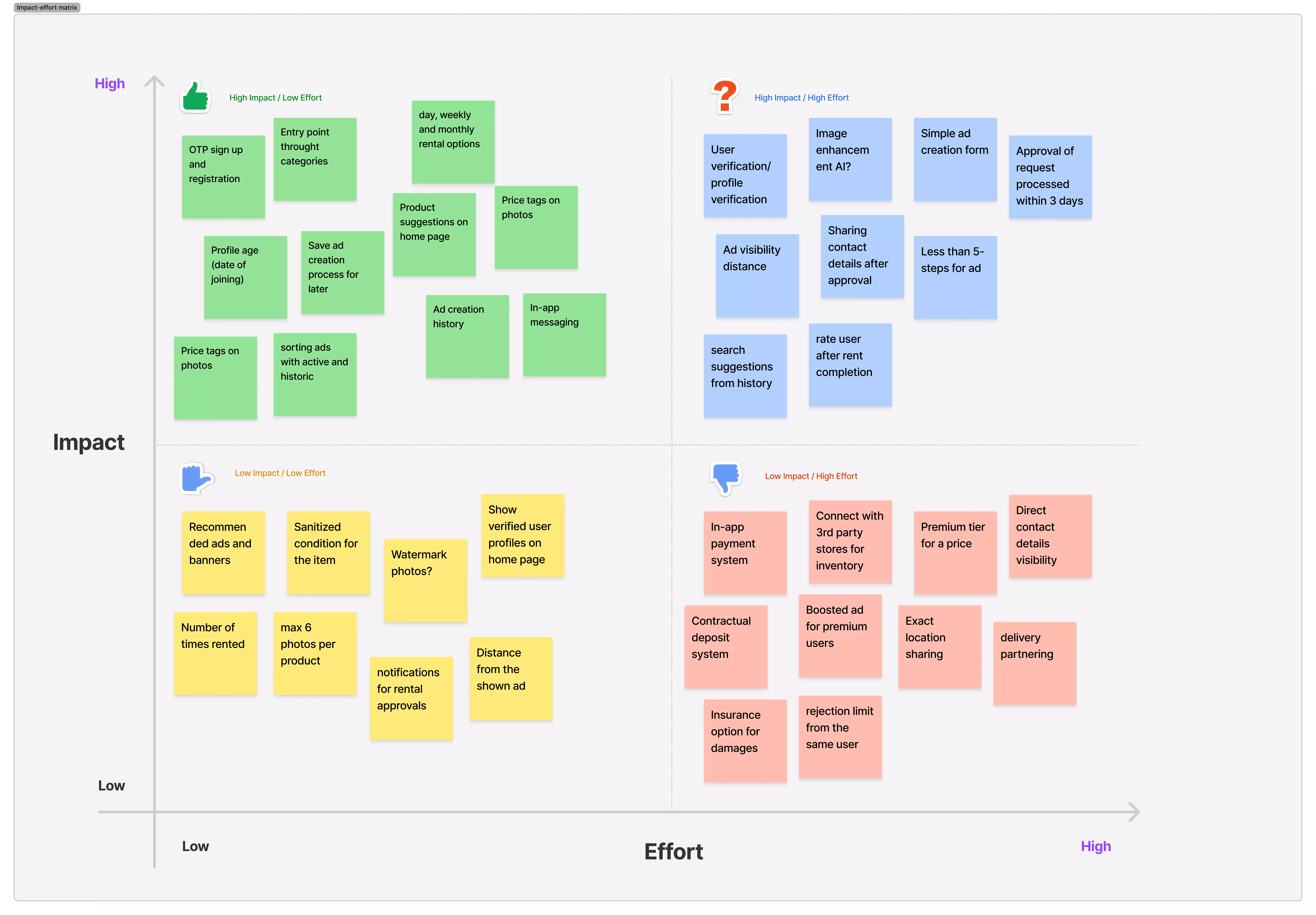
Impact vs. Effort grid to prioritise what features to include in the prototype
THE FACE(S) OF RENTEARN
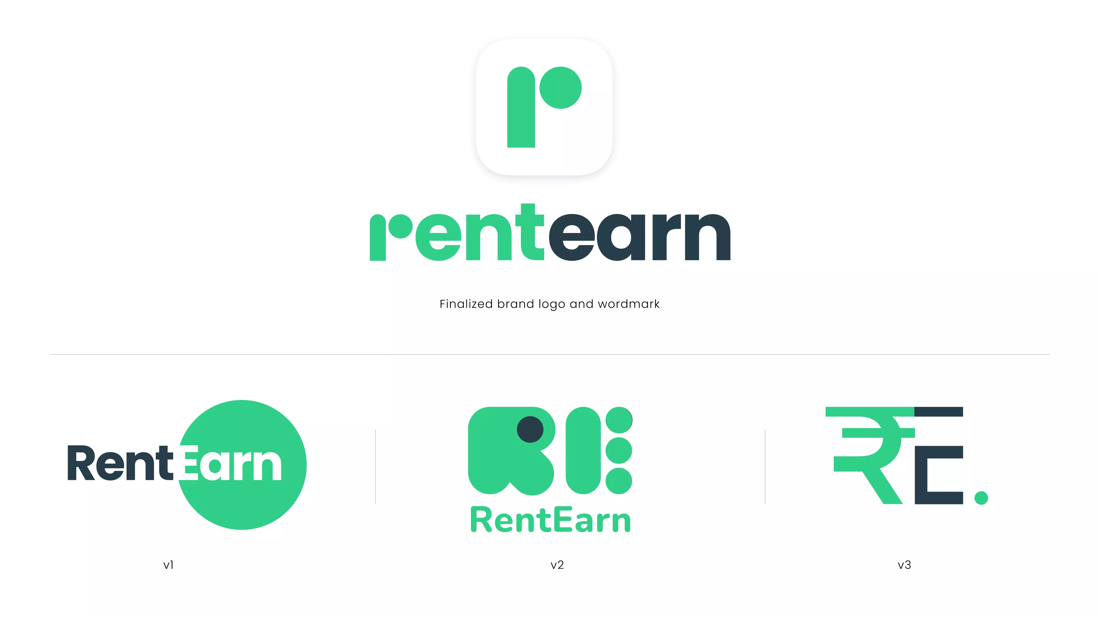
The many iterations of RentEarn logo and the finalized version
USER FLOW
After iterating through idenitity for the app, I explored the information flow in FigJam. My client and his team of developers appreciated the collaboration on this.
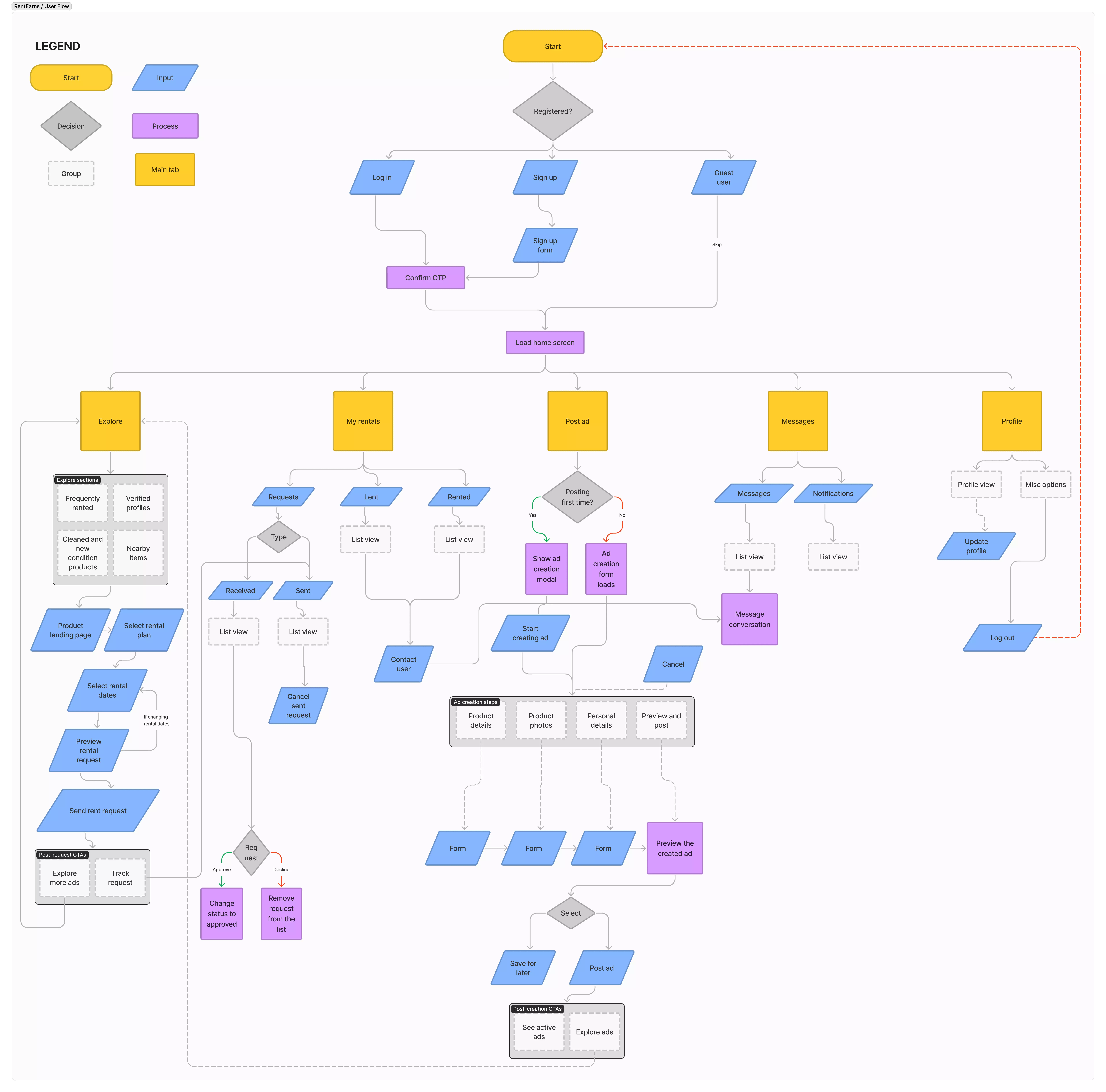
User flow created in FigJam
4. Prototype
Getting into the good stuff, I started drafting a medium-fidelity prototype to be shared with the team, incorporating some visual elements of the brand.
THE ROUGH DRAFT
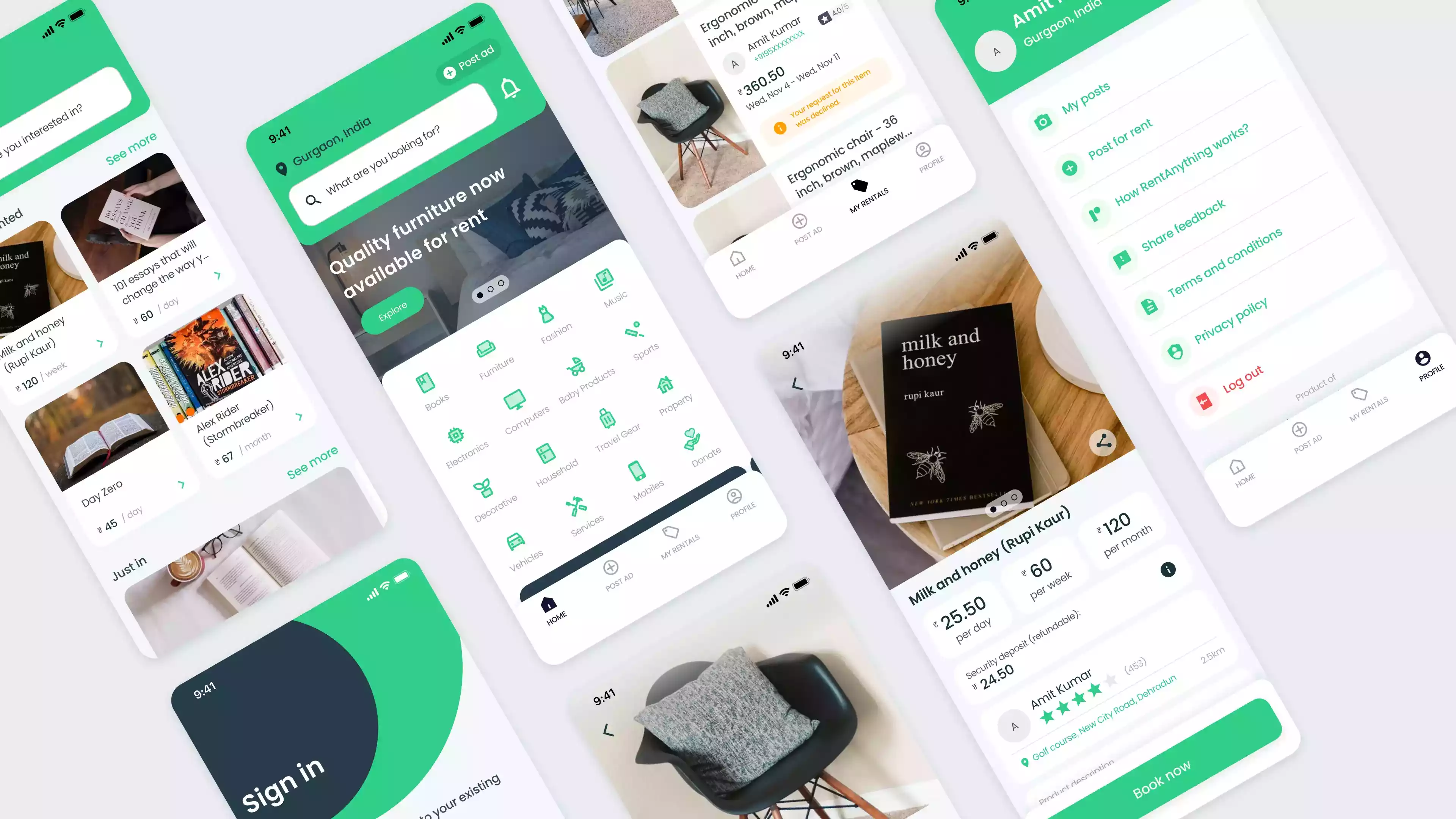
Medium fidelity prototype
CREATING A DESIGN SYSTEM
I created the design system keeping the following things in mind;
Composable, modular and intuitive elements
Accessible first theme
Modern yet familiar to the ecommerce space
Structure for easier developer collaboration
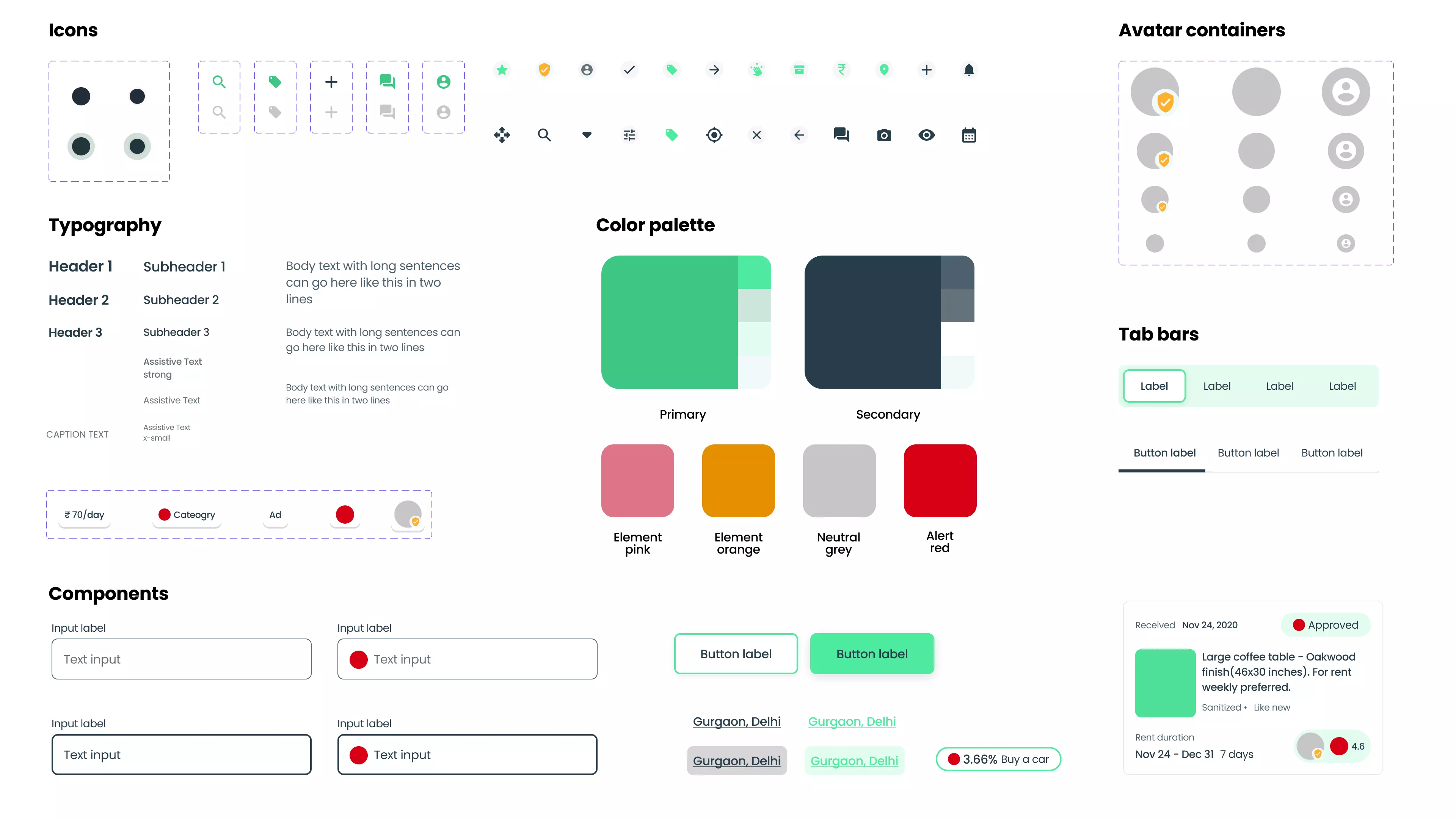
The design system
5. Testing and Impact
The moment of truth(s). Putting to test the medium fidelity prototype provided some great insights. Based on this, we incorporated a high-fidelity prototype and tested it again.
We asked about 8 participants to test the high-fidelity prototype on usertesting.com.
TESTING TASKS
1.
Sign in to your account
(Scenario: You already have an existing account with RentEarns)
2.
Searching for a product: Coffee table and narrow the results within a category
3.
Book your coffee table for rental, with a week long duration
4.
Create a new ad
(Note if skipping the verification step?)
5.
Accept and delete rental requests for your ad
6.
Schedule a meeting time for your coffee table rental
TEST RESULTS
- 75% of users testing the prototype were able to sign in to the app. About 25% still looked for a way to sign up instead of signing in
- About 87% of users (7/8) were able to successfully search for a coffee table using the search function and filter their results by picking the furniture category
- 62% of users read through the complete ad before selecting the weekly rental option. 94% of them successfully booked the coffee table for a week long rent.
- About 87% participants also chose to track their rental request after booking their rental.
- While creating a new ad for rental, about 75% of users successfully posted a new ad
- 12% of users skipped the verification while posting a new ad
- About 37% found it difficult to discover options for accepting or declining a rental request
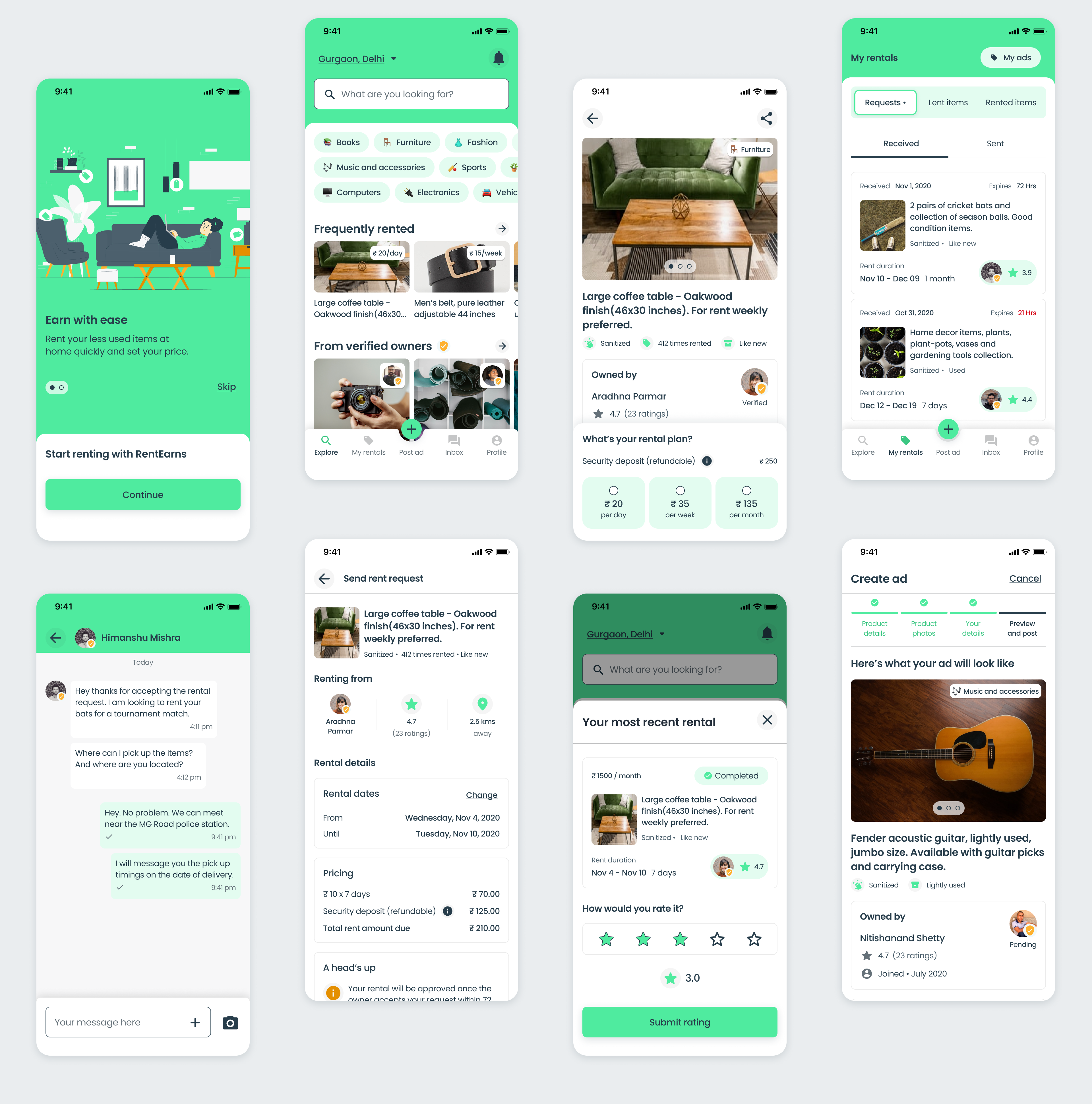
Final high-fidelity screens
Some takeaways and next steps
- Working on this project was a collaborative and learning experience. I got to conduct some research and usability testing
- Being the solo designer, I learnt to navigate different roles in a product design setup
- The design system exported with Zeplin proved to be an efficient way to understand the developer needs from a UX designer
- For next steps, I want to further test the MVP post-development, before the launch in order to note the sign up process
- Measuring the success metrics like ad-completion, rental requests for an item, user sign ups are the things I want to focus on next
